When designing or creating a brand, one of the first things founding members will do—after deciding on a name — is developed a logo. The logo is tied into the name of the business somehow, so all the brand elements complement each other.
What about the typography? This is the text or typeface that goes along with that logo, spelling out the company name, taglines, title, and much more. That doesn’t matter, right? The logo, name, and visual themes seem like they’d be more important – so why should typography even be considered?
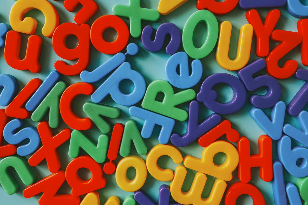
Typography vs. Fonts
In a general sense, the terms typeface, font, and typography can be used interchangeably. However, even with that being the case, it’s important to understand the differences between these terms.
Back in the good old days of analog printing — with metal sheets and blocks — typeface referred to the visual style and font referred to the size and weight. Therefore, you might have the Times New Roman typeface, italicized in 28 points, which is the font. Today, with digital typeface and fonts, the terms have meshed.
Typography, on the other hand, is the entire visual spectrum involving text-based content. It encompasses the entire visual style, which includes the typeface, weight, size, white space, contrast, and even how it’s presented.
When you’re choosing typography for your brand, it means considering all the disparate elements related to the visual style of text, not just the theme — such as Garamond or Arial. It’s the totality of the decision that matters most.
With that established, how does typography factor into a brand’s identity? Why is it so important, and how does it affect reputation and recognition?
Brand Personality On Choosing Fonts
When you decide to choose fonts for your brands, you must think about brand personality too. Brand personality revolves around a few key points. First is your brand traits. This involves understanding the actual characteristics of your brand. Some examples may include: funny, enthusiastic, trustworthy, or laid back. These traits are combined with your brand voice. How does it talk? What does it say? These questions along with the traits help narrow your focus, so you can talk with your customers. Your brand personality is communicated through every design element, from image selection to color, to typography choice, to the tone used in your text content.
Is Your Brand Serif or Sans-Serif?
With this basic knowledge, you can start to understand how to use typefaces for communicating brand personality. If your brand tends to be loud and brash, then you may want to use a sans-serif typeface to send a bolder, stronger message. On the other hand, if you want to communicate trustworthiness, you may opt for a serif typeface to put your demographic at ease. Serif typefaces feel more traditional, so they can help your customers feel like they can trust you; they say “I’m reliable and won’t rip you off.” These are very basic deductions, but they are powerful ones.
How Typography Affects Your Brand Image
Typography refers to the entire visual spectrum of text, which means it has a direct influence on brand image. Messy, cluttered text that is difficult to read is going to look unprofessional and will also bog down the user experience.
That reflects poorly on the business, obviously, but it also reveals that the company itself has no clear vision, organized focus, or theme. That’s bad news, especially for investors who want to see something solid, reliable, and promising.
There’s no single channel where typography matters more. It is expansive and reaches everything from web copy and paper printouts to social media posts. Wherever the text is used, the brand’s typography and image should be considered.
Here are 8 specific typography traits that can impact brand image
1. Font
The font is the overall makeup of text and includes multiple characteristics such as style, weight, and size. You might have two completely separate fonts even within the same family. Times New Roman at 28 points in bold, for instance, is a completely different font than Times New Roman at 48 points in italics.
2. Size
Size is exactly what the name implies, but with digital text and content, it is denoted using point or pixel-based ratings. A 30-point font in italics would be one example. If it’s too small the material is difficult to read, and if it’s too large it can be too in-your-face. Larger text sizes are also used to call attention to a particular element, like titles or headings.
3. Weight
Weight refers to the additional characteristics, commonly meaning bold print but also italics, underlined, or even strike-through. Sometimes it’s necessary to consider weight when using various fonts. One might look too thin, especially on a white background, so swapping to bold print will provide a better experience.
4. Style
The style refers to the visual theme or type of text — be it Times New Roman, Calibri, Arial, Verdana, or something unique. This is the biggest trait when it comes to deciding on brand image or relevance.
Choose a more cartoon or robotic print, and you’re giving your brand a whimsical feel. Choose something more elegant, and you’re going with a professional feel. Custom styles and typefaces are a great way to really differentiate your brand, particularly because no one else will be using it.
5. Color
Color explicitly refers to the shade of text elements or letters. The red, blue, or green text would be the example here. Another less common element is highlighting, or what color is encompassing the text. This can have a direct impact on the user experience because when poorly used, it can make text hard to read or too jarring.
6. Accents
Accents include other visual animations or additions, such as a drop-shadow, stroke, outline, glow, or even beveled appearance. This trait is hit or miss and really depends on a lot of the other surrounding elements.
For instance, a black drop shadow on a white background can look fantastic and add a little extra depth to the font. However, if the background is black, the shadow is obviously not going to show. Other traits like a beveled look can make text tough to read at times.
7. White Space
When working with text in office and document apps, you have to consider the spacing. Double-spaced lines look better sometimes. With web copy and digital content, it’s more about white space in the surrounding areas. Cram’s text is too close together, and it’s going to look cluttered and ugly. Proper use of white space in typography is necessary, even when you’re not thinking about it directly.
8. Presentation
This trait refers to how the text is presented or displayed. It can include the orientation such as left, center, or right aligned, but it can also include similar characteristics.
Extracting a bit of text and presenting it as blockquote is one common use. Jumbling text and displaying it across spaced areas outside conventional methods is another example.
Typography Matters
As a whole, typography is often overlooked or forgotten when it comes to building a brand image. That leads to the kind of shoehorned experience that is jarring because the text is used so often across many channels and promotions.
While it’s not possible to keep your typography identical across every platform — some dictate what fonts you can use — you should follow the general style as close as possible.
When choosing the initial style, consider the traits above and how they affect the final design. There are many characteristics of a good font or typeface beyond the basics like color, weight, or size.
By choosing the right font for your brand, you help your customer to understand your message, your product, and how they can trust you. It sounds ridiculous, how a font can be so powerful to a brand, but this is real, and it happens many times. Your font will define who you are and what brand you want to promote, choosing the right font will help about 50 percent on promotion, it’s quite effective to build trust and professionalism between you and your clients or customers.


6 Responses
I want to express my deepest gratitude to the site owner for publishing this excellent piece of writing on their site.
I truly appreciate your technique of writing a blog. I added it to my bookmark site list and will
I appreciate you sharing this blog post. Thanks Again. Cool.
Thanks I have recently been looking for info about this subject for a while and yours is the greatest I have discovered so far However what in regards to the bottom line Are you certain in regards to the supply
I do not even know how I ended up here but I thought this post was great I do not know who you are but certainly youre going to a famous blogger if you are not already Cheers
I simply could not go away your web site prior to suggesting that I really enjoyed the standard info a person supply on your guests Is going to be back incessantly to investigate crosscheck new posts