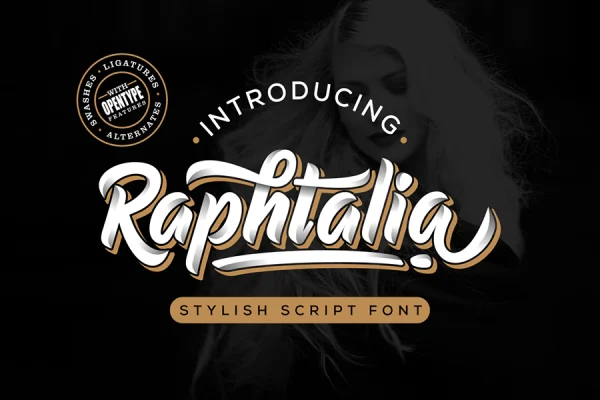
People often ask how long it takes to make a font. The honest answer is: much longer than it looks. In this article I want to show you the real process behind one of our fonts, Raphtalia, from the first curve in Adobe Illustrator to the files you download from our shop. No secret formula, just the tools I use, the steps I follow, and the part that takes the most patience.
I’m Nur Faizin, the type designer behind Nurf Designs. I have been making fonts since 2018, and Raphtalia is a good example of how a typical Nurf font comes to life.
The Idea Behind Raphtalia
Raphtalia is a bold, stylish script. I wanted a font with energy and personality that still stays readable on packaging, posters and promotional materials, where a script has to work hard at small sizes and from a distance. That goal shaped every decision that followed: thick, confident strokes, clear letter shapes and connections that flow without becoming messy.
Step 1: Drawing the Letters Directly in Illustrator
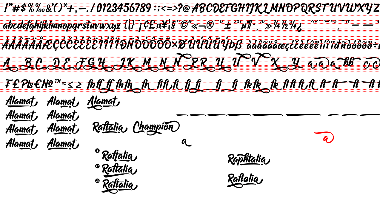
Many lettering artists start with pencil sketches or an iPad. I don’t. For Raphtalia, I drew every letter directly on the computer with the Pen tool in Adobe Illustrator.
Drawing with the Pen tool means building each letter from anchor points (nodes) and curves. It gives me full control over the shape from the very beginning, and the result is already a clean vector, so there is no need to trace a scanned sketch later.
The challenge is that every curve has to be right. A script font repeats the same strokes again and again, so a small bump in one curve will show up in dozens of letters. I spend a lot of time zooming in, moving nodes and adjusting handles until the curves feel smooth and consistent.
Step 2: Vectorizing and Cleaning Up
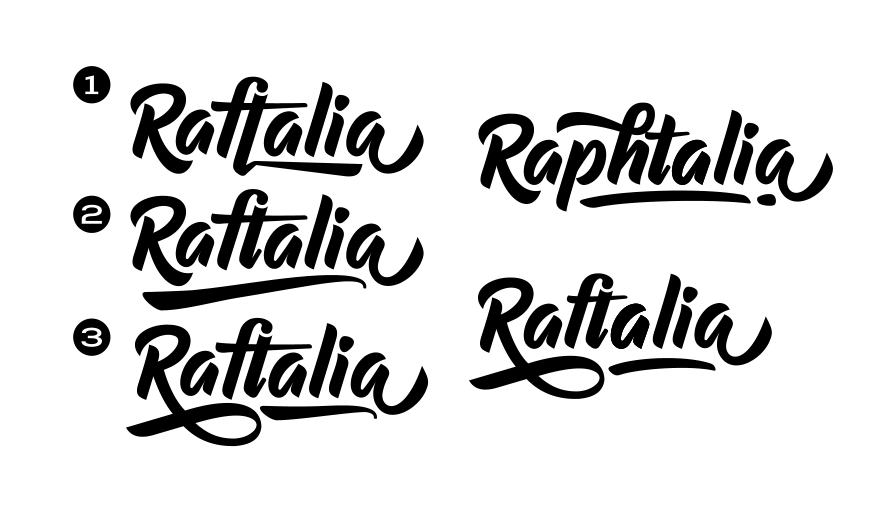
Once the alphabet is drawn, I go through every character in Illustrator to clean up the vectors: removing unnecessary nodes, fixing overlaps and making sure similar strokes share the same thickness and angle. Uppercase, lowercase, numbers and punctuation all need to look like members of the same family.
This cleanup is not glamorous, but it matters. Fewer, well-placed nodes make the font lighter, smoother and easier to edit in the next step.
Step 3: Building the Font in FontCreator
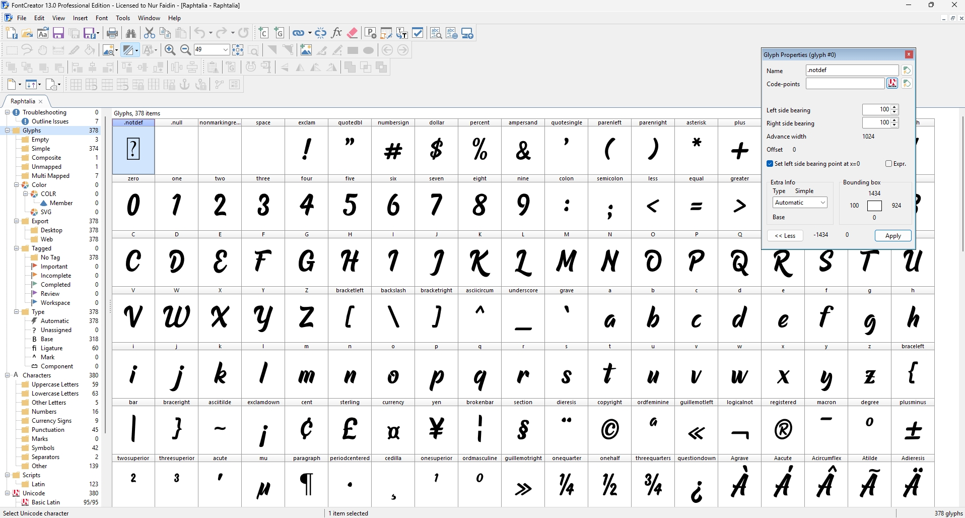
Next, I move the letters into FontCreator, the font editing software I use to turn drawings into a working font. This is where the font gets its technical life:
- Each glyph is placed on the correct baseline and given the right width.
- Spacing is set so that letters sit comfortably next to each other.
- Kerning pairs fix the gaps that spacing alone cannot solve.
- Ligatures and alternate characters are added, so letter combinations connect naturally.
- OpenType features are set up so designers can reach the extras in their apps.
The Hardest Part: Kerning
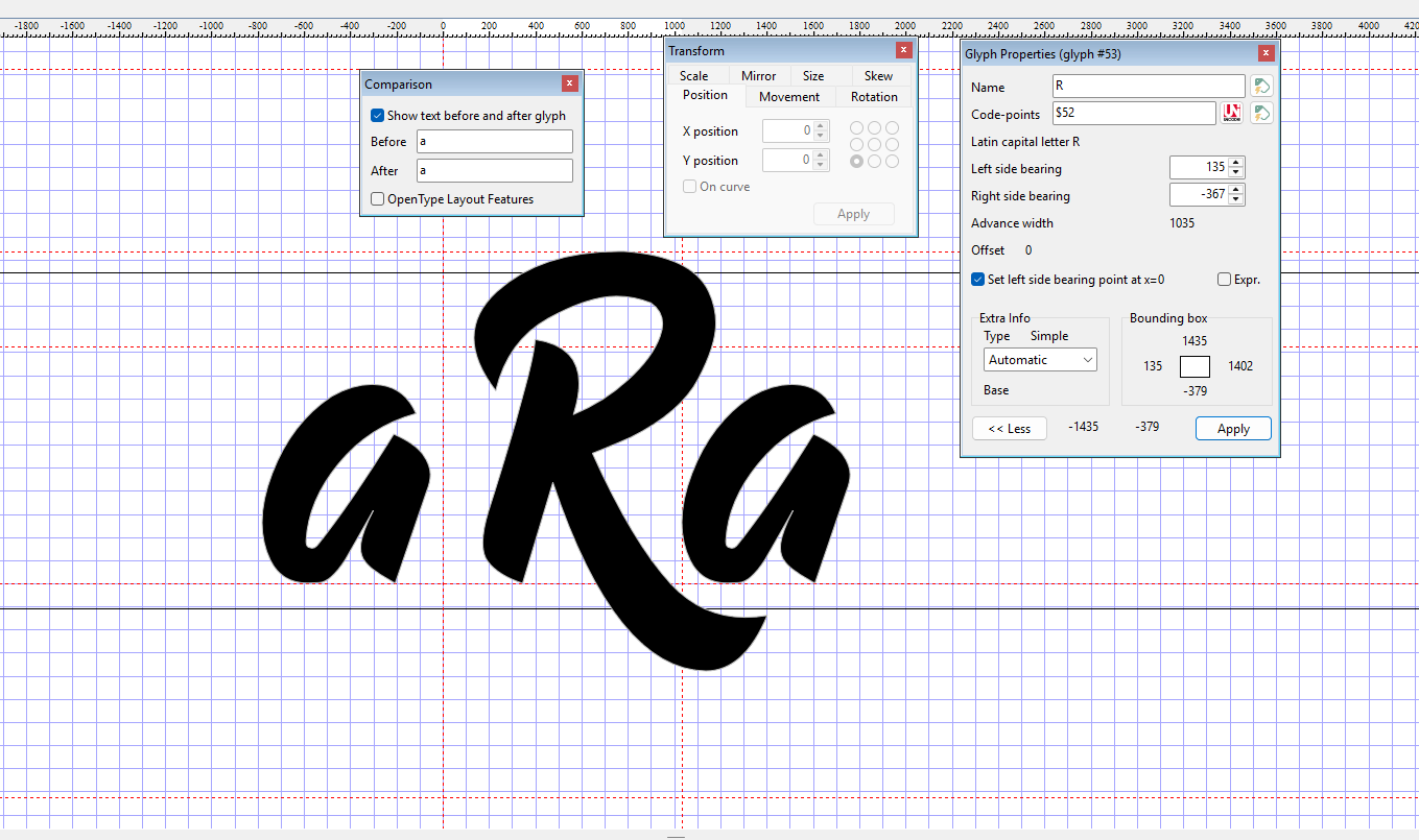
If you ask me which part takes the longest, it is the work inside FontCreator, and especially kerning. Raphtalia took about two months from start to finish, and a large part of that time went into kerning and ligatures.
Kerning means adjusting the space between specific pairs of letters. In a script font it is even more demanding, because letters connect to each other. Every pair has to be checked: does the stroke of the “o” meet the “r” at the right height? Is there an awkward gap between “T” and “a”? A single missed pair can make a word look broken, and there are hundreds of possible combinations.
There is no shortcut here. I type real words, look at them, adjust, and repeat. It is slow, but it is the difference between a font that looks good in the preview and a font that looks good in your actual project.
Step 4: Testing Before Export
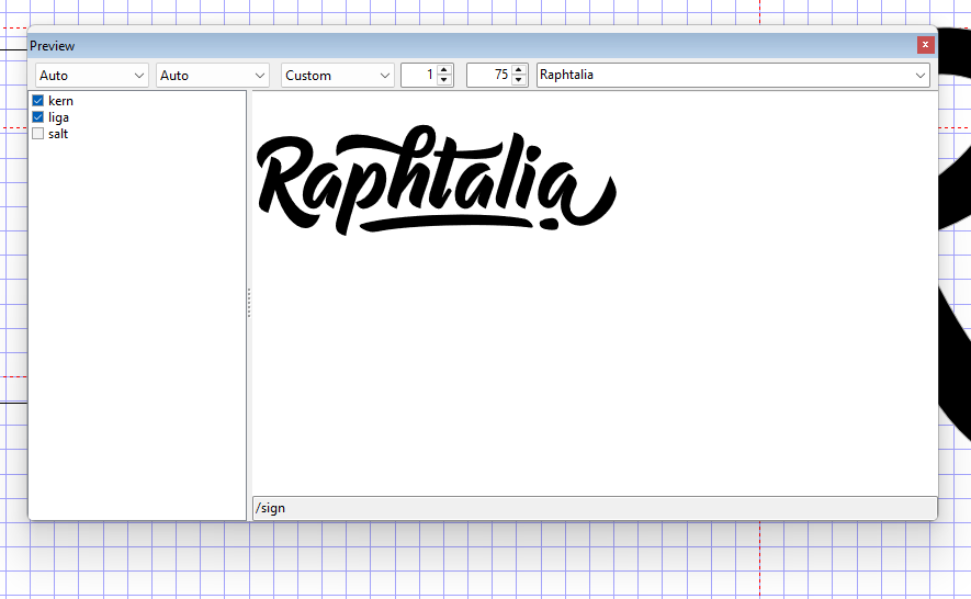
Before I export anything, I test the font inside FontCreator, which has a built-in testing feature. I type words, sentences and tricky letter combinations to see how the font behaves.
Testing usually reveals two kinds of problems:
- Nodes that are not clean enough. A curve that looked fine in Illustrator can show a small bump or wobble once you see the letter at large sizes.
- Missed kerning pairs. Some combinations only appear when you type real words, so testing always finds a few pairs I need to fix.
I go back, fix them, and test again until I’m happy. Only then do I export the final files: TTF, OTF and WOFF, so the font works in design apps, in Office and on websites.
Step 5: Making the Preview Posters
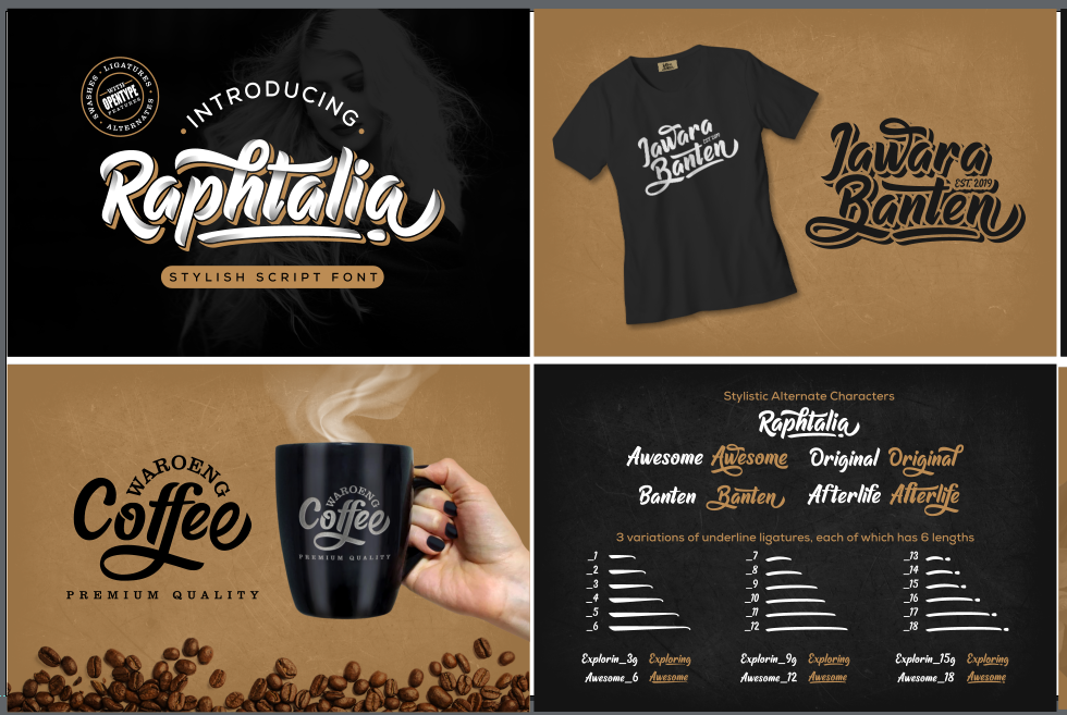
The last step is showing the font to the world. I create the preview posters in Xara Designer Pro. These images show the font in realistic designs, such as logos, labels and headlines, so you can imagine it in your own work before you buy.
What Making Raphtalia Taught Me

After many fonts, a few lessons stay the same:
- Clean curves save time later. Every messy node in Illustrator becomes a problem in FontCreator.
- Kerning is never “done” on the first try. Real words always reveal something new.
- Test like a real user. Type names, slogans and full sentences, not just the alphabet.
The next time you install a font, I hope you remember the two months of curves, nodes and kerning pairs behind it. If you want to see how Raphtalia turned out, take a look at Raphtalia, or learn how to combine a script like this with a simple text font in our guide on how to pair fonts.