Choosing one good font is easy. Choosing two that look good together is where many designs go wrong. Font pairing is the skill of combining a headline font and a text font so they contrast clearly but still feel like they belong to the same design. The good news: a few simple rules, plus some proven combinations, will get you great results every time.
The Rules of Font Pairing
1. Create contrast
The two fonts should look clearly different. Common contrasts are serif with sans serif, script with sans serif, or a heavy display font with a light text font. If two fonts are too similar, the result looks like a mistake.
2. Give each font one job
One font leads (headlines, logos, titles) and the other supports (paragraphs, captions, buttons). Do not swap their roles from page to page.
3. Match the mood
Contrast in shape, harmony in feeling. A playful headline font pairs better with a friendly, rounded text font than with a stiff, technical one.
4. Keep it to two (or three)
Two fonts are enough for most projects. If you need a third, use it only for small accents like labels or numbers.
5. Use a font family for extra variety
Instead of adding more fonts, use different weights and styles (light, regular, bold, italic) of your text font.
10 Font Combinations That Always Work
Most of the fonts below are free on Google Fonts under the Open Font License, so you can use them in commercial projects.
1. Playfair Display + Source Sans 3
Playfair Display is an elegant, high-contrast serif for headlines, and Source Sans 3 is a clear, neutral sans serif for text. Perfect for blogs, magazines, and lifestyle brands.
2. Montserrat + Merriweather
Montserrat is a geometric sans serif that looks bold and modern in headings. Merriweather is a sturdy serif designed for comfortable reading on screens.
3. Bebas Neue + Open Sans
Bebas Neue gives tall, condensed, all-caps headlines with impact, and Open Sans keeps body text friendly and readable. Great for events, fitness, and marketing pages.
4. DM Serif Display + DM Sans
DM Serif Display and DM Sans were designed as companions, so they share proportions while contrasting in style. A safe, polished choice for startups and portfolios.
5. Oswald + Lato
Oswald is a condensed sans serif for strong headings, and Lato is a warm, round sans serif for text. Works well for news, sports, and corporate sites.
6. Abril Fatface + Poppins
Abril Fatface is a heavy, dramatic display serif. Paired with the clean geometry of Poppins, it creates fashion-magazine style headlines.
7. Raleway + Lora
Raleway is a stylish, thin-to-bold sans serif, and Lora is a gentle serif with calligraphic roots. A soft, elegant pairing for wellness and boutique brands.
8. Roboto + Roboto Slab
Roboto and Roboto Slab come from the same superfamily, so they match perfectly. Use the slab for headings and the sans for interfaces and text.
9. Great Vibes + Cormorant Garamond
Great Vibes is a flowing script for names and short titles, and Cormorant Garamond is a refined serif for details. A classic combination for wedding invitations.
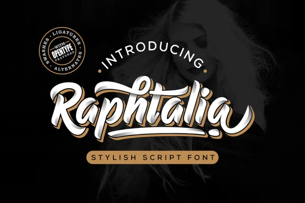
10. Raphtalia + Poppins
Raphtalia, our bold vintage-style script, adds personality to logos, packaging, and social media headlines. Paired with Poppins for text, it keeps the design fun but readable. This combination works well for cafés, clothing brands, and creative businesses.
How to Test a Font Pairing
- Create a mock page with a real headline, a subheading, and two short paragraphs.
- Check it on a phone and on a desktop screen.
- Make sure the headline stands out and the paragraph is easy to read.
- Look at it in black and white. If the hierarchy still works without color, the pairing is strong.
- Ask someone else which text they read first. It should be the headline.
Common Font Pairing Mistakes
- Two scripts together. They compete for attention and are hard to read.
- Two very similar fonts. For example, two geometric sans serifs that differ only slightly.
- Decorative fonts for body text. Keep paragraphs in a simple, readable font.
- Too many weights and sizes. Define a small type scale and stick to it.
For more on choosing sizes and building hierarchy, read our guide to font sizes and styles. If you are building a brand, see how to choose the right fonts for your brand.
Frequently Asked Questions
What is the easiest font pairing for beginners?
A serif headline with a sans serif body text, such as Playfair Display with Source Sans 3. It creates clear contrast and rarely looks wrong.
Can I pair two sans serif fonts?
Yes, if they contrast clearly in weight or width, such as a condensed bold headline font with a regular text font.
Are Google Fonts free for commercial use?
Fonts on Google Fonts are released under open licenses, such as the Open Font License, which generally allow commercial use. Check each font’s license page to be sure.