You can write the most useful article on the internet, but if it is hard to read, most people will leave before the second paragraph. Fonts are the bridge between your words and your readers. They decide how quickly people can scan a page, how long they stay, and what they feel while reading.
Fonts Make Content Readable
Readability is the most important job of any font used for content. Readers judge a page in seconds. If the text looks dense, tiny, or tiring, they skip it. A readable setup usually includes:
- A clear, familiar typeface for body text.
- A comfortable size: at least 16px on screens.
- Line spacing around 1.5.
- Short paragraphs with space between them.
- Dark text on a light background, or the reverse with enough contrast.
Fonts Guide Attention
Online readers scan before they read. Headings, subheadings, bold phrases, and lists give them anchors. A strong typographic hierarchy lets someone understand the structure of an article in a few seconds and jump to the part they need. That makes them more likely to stay, and pages that keep readers engaged tend to perform better in search.
Fonts Set the Tone
The same sentence feels different depending on the font. A heading in a playful handwritten font says “this is fun and personal”. The same heading in a sharp, bold sans serif says “this is serious and efficient”. Choose heading fonts that match the voice of your writing.
Fonts Build Recognition
When your blog, newsletter, and social media graphics use the same fonts, people start recognizing your content before they see your name. Consistent typography turns individual posts into a recognizable series. Learn more in our guide to fonts in branding.
Choosing Fonts for Different Types of Content
Blog posts and articles
Use a simple, readable font for paragraphs and a slightly more expressive font for headings. Featured images and Pinterest graphics are a good place for display or script fonts.
Social media graphics
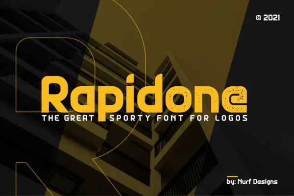
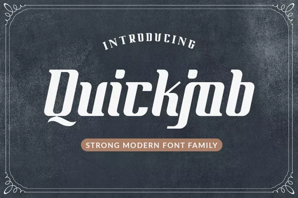
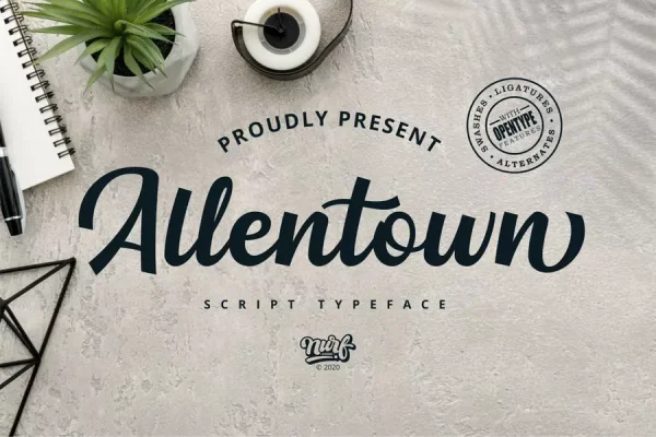
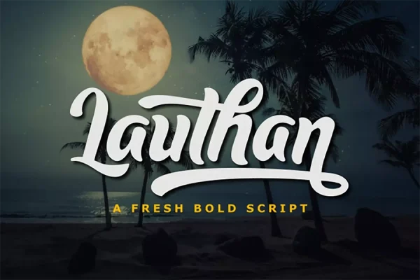
You have a second or two to stop the scroll. Bold display fonts like Rapidone or Quickjob grab attention, while scripts like Allentown or Lauthan add style to quotes. Keep text short and large enough to read on a phone.
Email newsletters
Many email apps only show standard system fonts, so put your brand fonts in images such as headers and keep body text in a safe, readable font.
YouTube thumbnails and video titles
Use heavy, high-contrast lettering that is readable at thumbnail size. Boorush and Spantaran are strong options.
Quotes and personal posts
Handwritten fonts such as Culington or Wishper Script make quotes and personal messages feel warm and human.
Common Content Typography Mistakes
- Decorative fonts for paragraphs. Save them for short headlines.
- Too many fonts. Two fonts usually look cleaner than four.
- Walls of text. Break content into short paragraphs, headings, and lists.
- Text over busy images. Add a solid or blurred background behind text so it stays readable.
Frequently Asked Questions
What font size is best for blog posts?
Around 16 to 20px for body text on screens, with line spacing of about 1.5.
Should I use the same font for headings and body text?
You can, but pairing an expressive heading font with a simple body font usually creates clearer hierarchy and more personality.
Can I use script fonts in social media posts?
Yes. Script fonts work very well for short quotes, names, and headlines in graphics. Make sure the text is large enough to read on a phone.