Color is often the first thing visitors notice on a website, even before they read a word. It sets the mood, draws attention to buttons, and helps people recognize your brand. Choosing website colors is not only a matter of taste: some combinations make pages easier to use, and others quietly push people away.
How Colors Influence Visitors
Color associations depend on culture, context, and personal experience, so there are no universal rules. Still, some associations are common enough to be useful starting points:
- Blue: calm, dependable, professional. Popular with banks, tech companies, and healthcare.
- Green: natural, healthy, growth. Common for eco, food, wellness, and finance brands.
- Red: energy, urgency, passion. Great for sales, food, and calls to action, but tiring in large areas.
- Orange: friendly, enthusiastic, affordable. Works well for buttons and youthful brands.
- Yellow: optimistic and cheerful. Use it carefully, since yellow text on white is hard to read.
- Purple: creative, imaginative, sometimes luxurious.
- Pink: playful, romantic, or bold depending on the shade.
- Black: elegant, powerful, premium. Common for fashion and luxury.
- White and light neutrals: clean, open, and modern. They let content and products stand out.
Building a Website Color Palette
Use the 60-30-10 rule
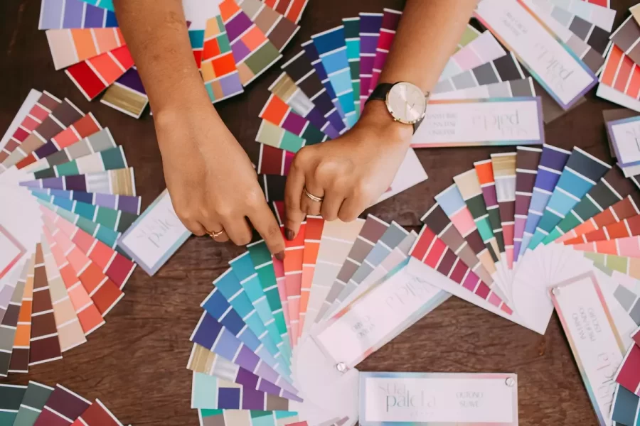
A simple way to balance a palette is to use a dominant neutral color for about 60% of the page (usually backgrounds), a secondary color for about 30% (sections, cards, headers), and an accent color for about 10% (buttons, links, highlights). The accent should be the color you want people to click.
Keep one accent for actions
If your buttons, links, and alerts all use different bright colors, visitors stop knowing what is clickable. Reserve one strong accent color for primary actions.
Check contrast
Text must have enough contrast with its background. Accessibility guidelines recommend a contrast ratio of at least 4.5:1 for normal text. Free contrast checkers make this easy to test.
Test on real screens
Colors look different on phones, laptops, and in bright sunlight. Check your palette on several devices before you commit.
Colors and Typography Work Together
Color and fonts should tell the same story. A soft pastel palette pairs naturally with rounded or handwritten fonts, while a black and gold palette suits elegant scripts. Some combinations to try:
- Playful pastel: Baby Born or Bellanovie headings with soft pink, mint, or lilac.
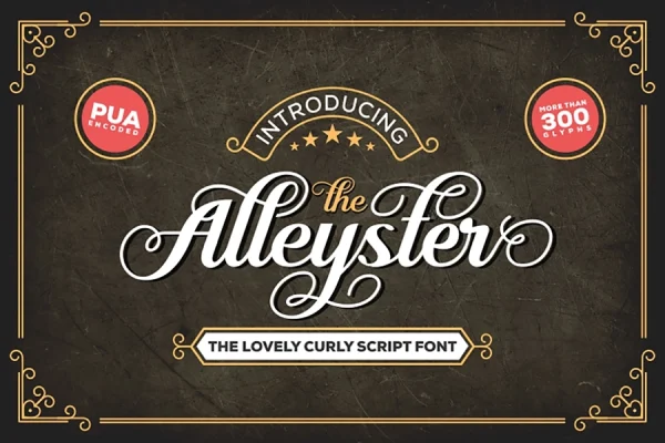
- Elegant dark: Dephiana or Alleyster in white or gold on black or deep navy.
- Natural and earthy: Mallorist or Hello Farmer with olive, beige, and terracotta.
- Bold and sporty: Spantaran in white on red, black, or electric blue.
Whatever you choose, keep body text dark on a light background (or light on a very dark one) and set it in a simple, readable font such as Raghill. For more on the role fonts play on a site, see how fonts improve the shopping experience.
Common Website Color Mistakes
- Too many colors. Stick to two or three main colors plus neutrals.
- Low-contrast text. Gray on gray or yellow on white is hard to read.
- Color as the only signal. Use icons or text labels as well, so colorblind visitors are not left out.
- Ignoring your brand. Website colors should match your logo, packaging, and social media.
Frequently Asked Questions
What is the best color for a “Buy” button?
There is no single best color. What matters is that the button contrasts strongly with the rest of the page and uses the same accent color consistently.
How many colors should a website use?
Usually one or two brand colors, one accent for actions, and a set of neutrals for backgrounds and text.
Do colors really affect sales?
Colors affect how easy a page is to use and how a brand is perceived, both of which influence whether people buy. Clear contrast and a consistent accent color matter more than any single shade.